Sett documentation and guidelines
Buttons
Buttons are interactive elements that allow users to perform actions that affect the application's state, such as adding, removing, or manipulating data.

Best practices
Buttons should:
Be clearly labeled to inform the user of any resulting action.
Meet WCAG 2.0 level AA accessibility standards.
Use established interactive colors appropriately.
Prioritize actions for the user.
Maintain consistent positioning throughout the interface.
Buttons vs. links
Buttons allow users to perform actions, such as "Create issuer," "Publish pathway," or "Add badge."
Links are used for navigation and usually appear within or following a sentence.
When deciding whether to use a Button or a Link, consider the following:
Buttons do things
Links go to places
Using these two components intentionally and consistently results in:
A more inclusive experience for assistive technology users
A more cohesive experience for sighted users
Features that are easier to maintain at scale
Accessibility
Buttons have multiple states which are visually displayed or programmatically conveyed to users.
Accessible labeling
Use an aria-label to help users better understand a button's intended action when accessing via assistive technologies like screen readers.
aria label practices:
Use an aria-label if the visible text doesn't convey the button's action intent adequately.
Use an aria-label if the button has no text and relies on an icon alone to convey the action.
Use aria-labels to prioritize grouped buttons so assistive technologies appropriately interact with primary and secondary actions.
Hide non-interactive icons from screen readers. They are read back to users as “image,” which can be misleading.
Labeling
Badgr button labels should be clear and accessible to every user. Ideally, content for visual buttons and screen readers should be identical. For ultimate clarity, button copy should include an action and a subject (a noun and a verb) to maximize clarity about what the button will do. This is especially important for irrevocable actions such as "Delete account." A few exceptions to this guideline include commonly used labels such as "Cancel," "Save," "Submit," etc. — but only when that action is very unlikely to be misinterpreted.
How to use
“Create badge”
“Submit”
How NOT to use
“Create”
“Submit form”
Keyboard interactivity
Buttons use browser defaults for keyboard interactions.
Give buttons keyboard focus with the tab key (or shift+tab when tabbing backwards)
Activate buttons with the enter/return key
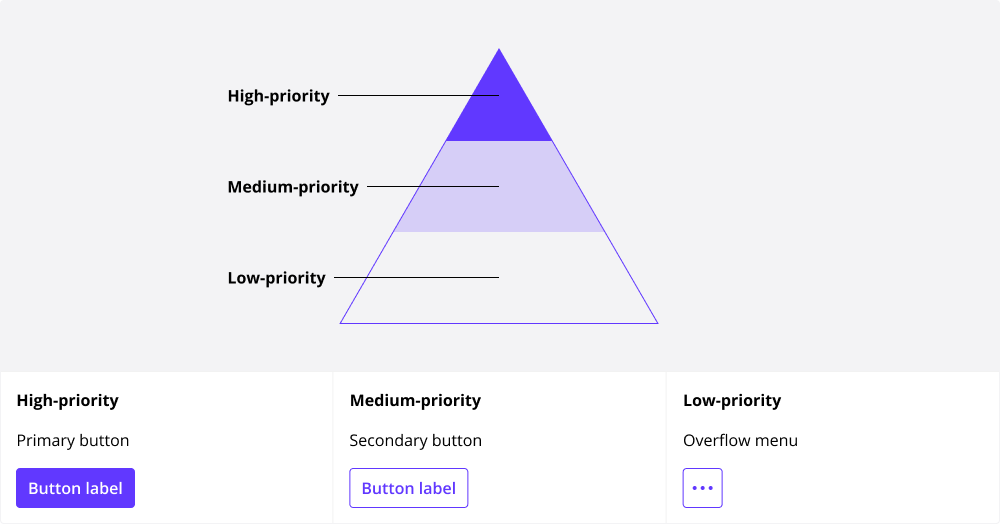
Hierarchy
A page should contain a single Primary button that carries prominence over other buttons on the page.
Multiple actions
A page can contain several buttons at a time:
High-priority
Medium-priority
Low-priority
Guidelines:
Only use one Primary button on a single page.
Use more Secondary button after a single Primary button.
Use more Overflow menus than Secondary buttons.
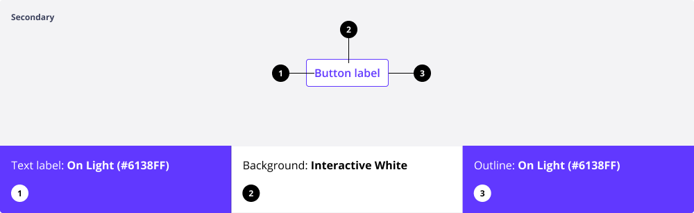
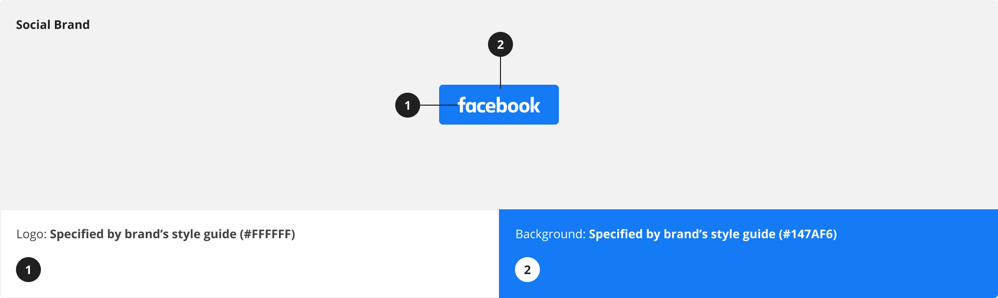
Anatomy
Buttons can deploy up to four parts:
Text label
Background
Outline
Icon

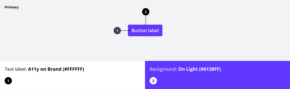
Color
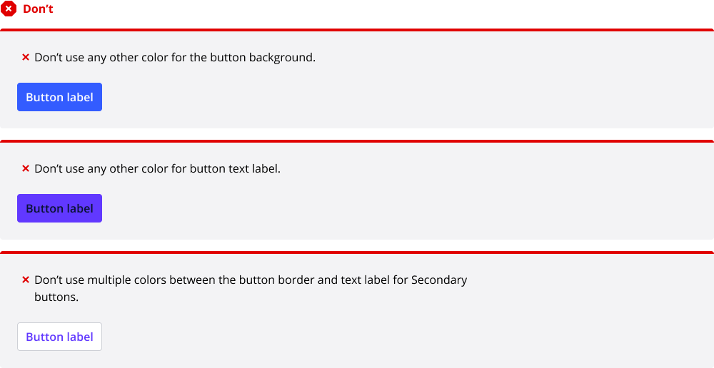
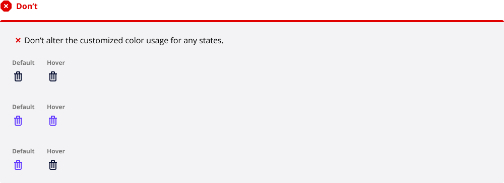
Badgr buttons are consistent and accessible. Do not use custom colors for buttons when within Badgr proper.
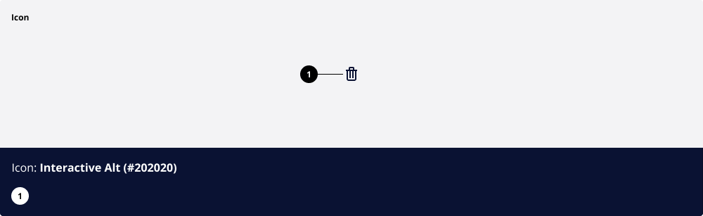
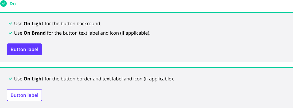
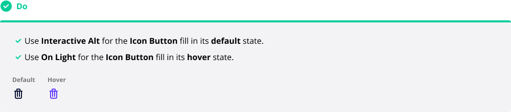
The Icon buttons don’t receive the primary interactive color in its default state, but DO receive the On Light color in its hover state.
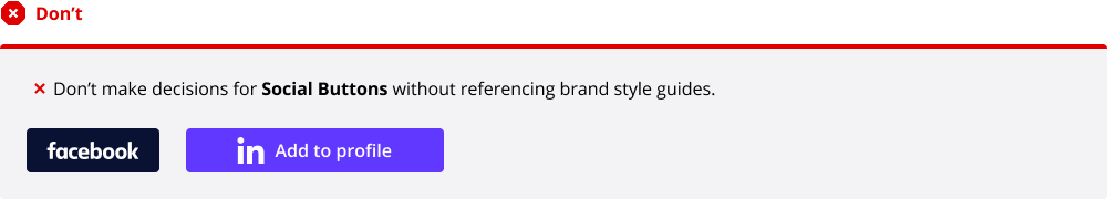
The Social buttons strictly follow their respective brand guides. DON’T make any custom design decisions without first referencing their brand guides.

White label
The Badgr application has the ability to be white-labeled, so it is important to use the correct colors for both button background as well as button label.
WCAG 2.0 level AA requires a contrast ratio of at least 4.5:1 for normal text and 3:1 for large text. A contrast checker, like webaim.org ↗️ should be utilized when creating components.


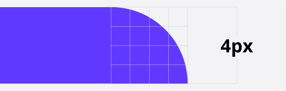
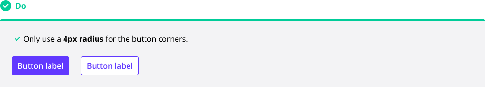
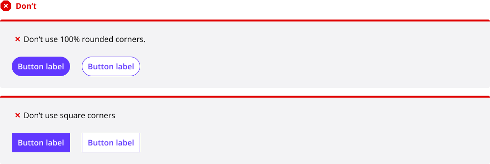
Shape
Badgr’s Primary and Secondary buttons have a custom 4px corner radius. The Icon button does not have a containing shape and is the size of the icon used in the button.
Typography
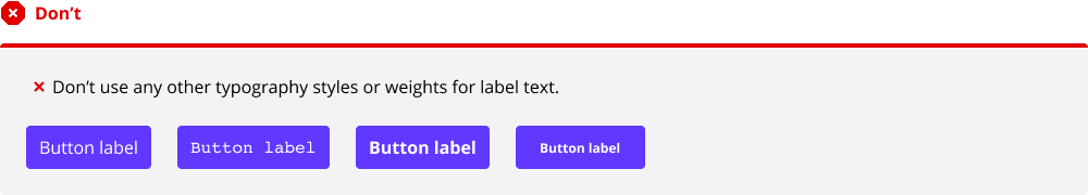
Badgr’s buttons use custom typography for the button label text.

“Button” only
Badgr buttons only use the Badgr “Button” typography style. Other typography styles should not be substituted.

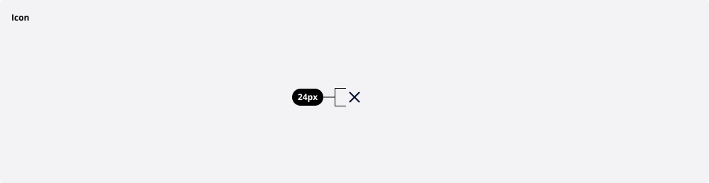
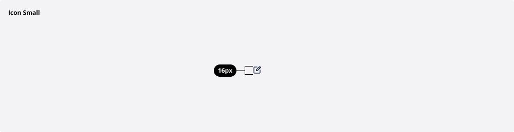
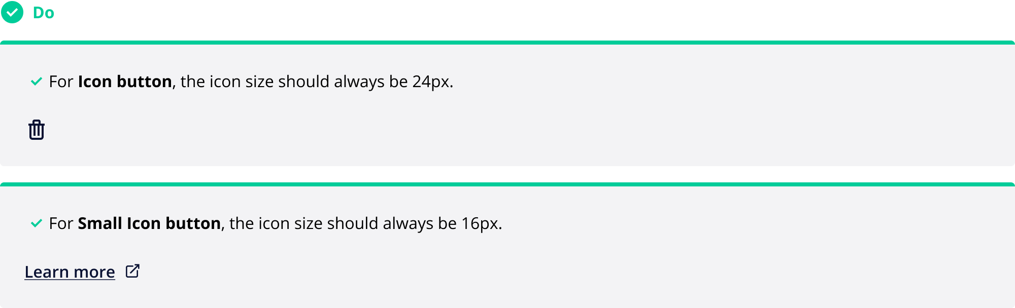
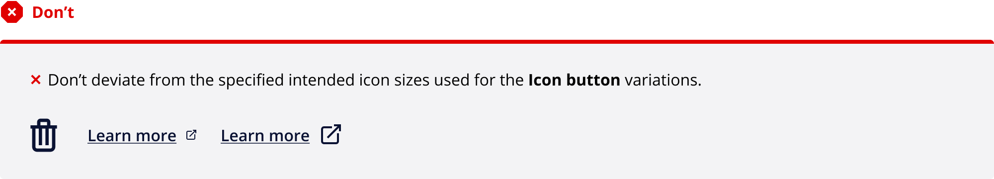
Icon size
For the buttons that deploy icons, there are two sizes:
Regular (24px)
Small (16px)
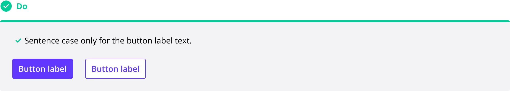
Text label
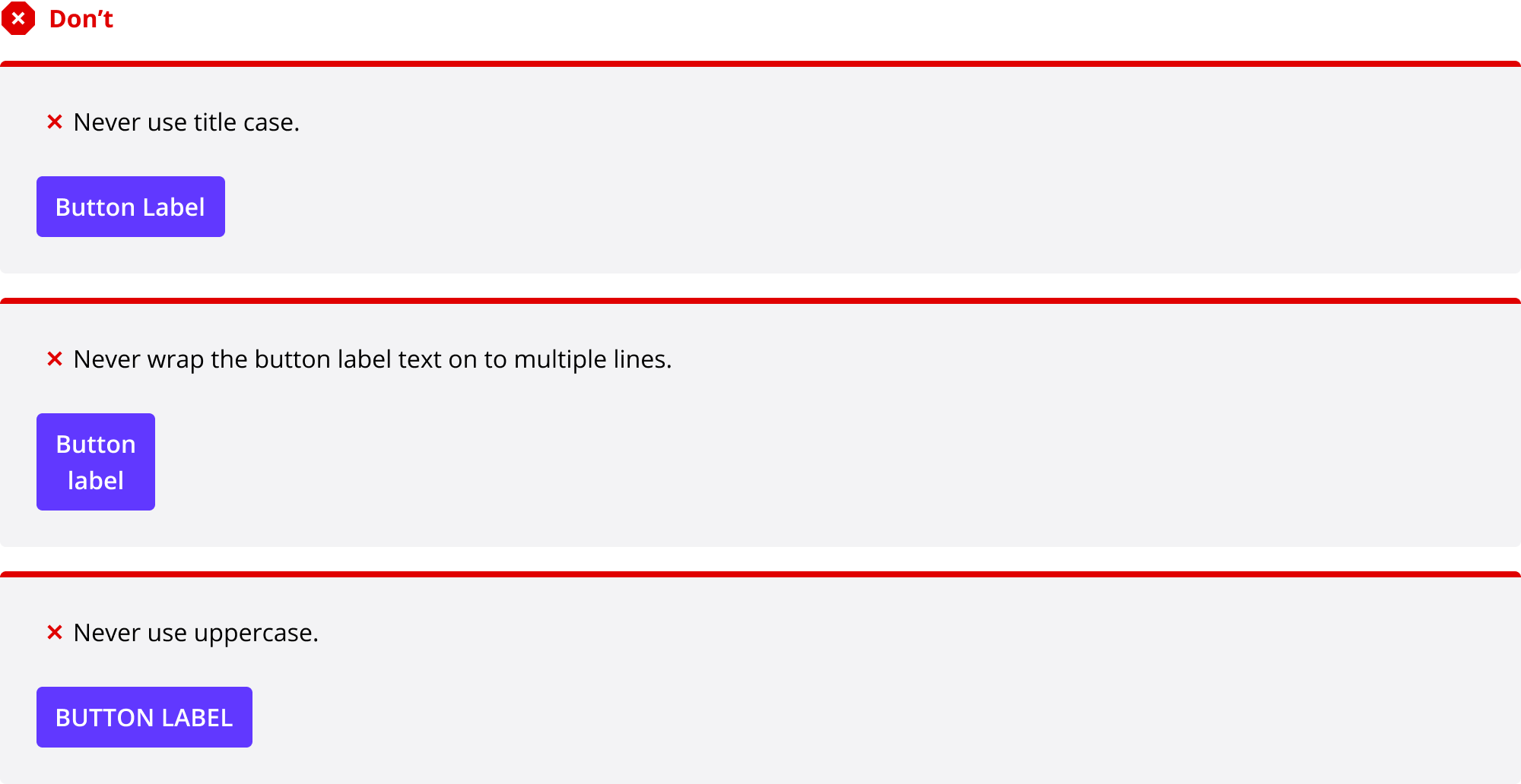
Button labels should use sentence case and never wrap on to more than one line.
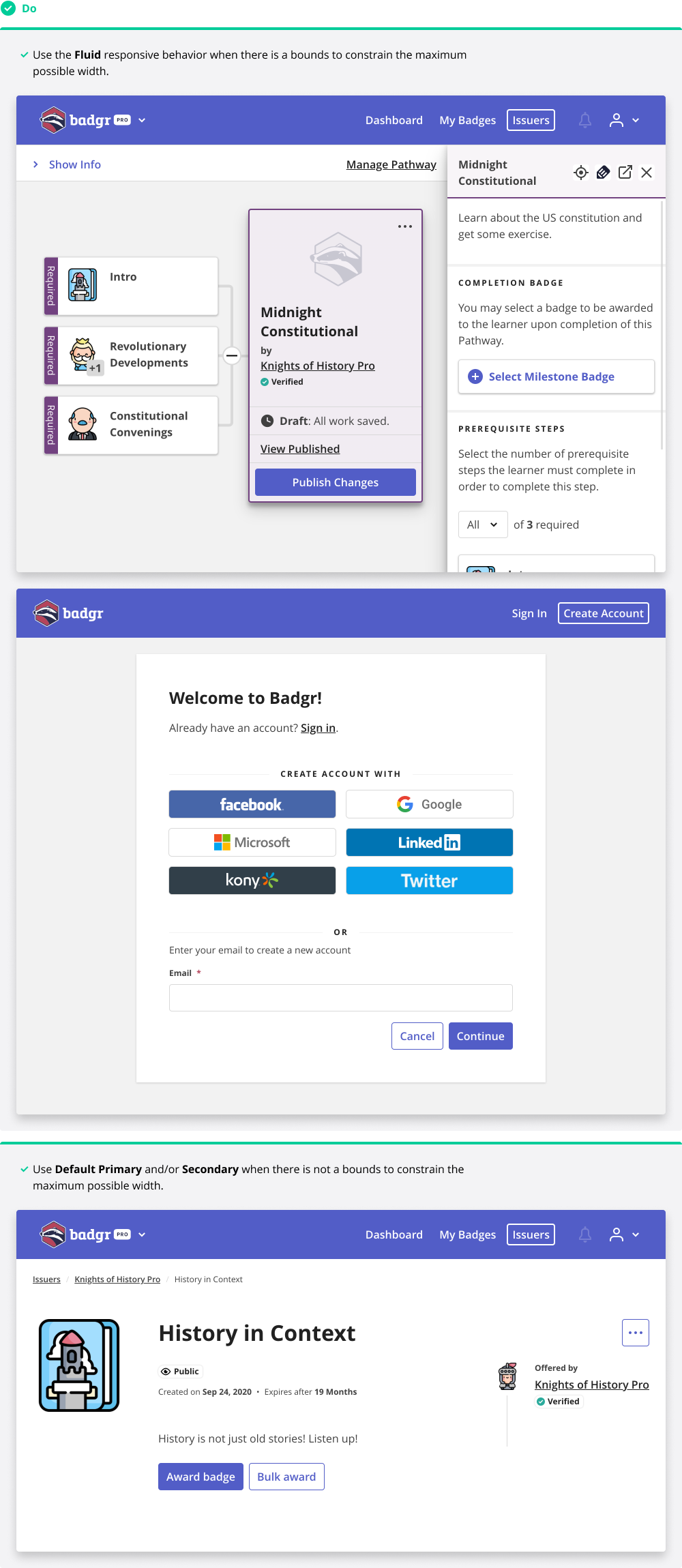
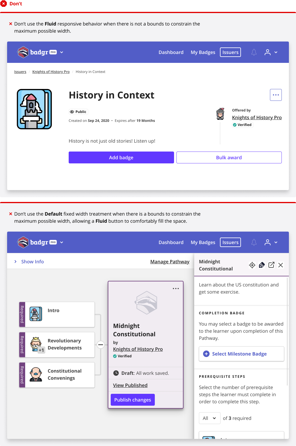
Button width
The Primary Fluid and Secondary Fluid variants should be used sparingly when there is a bounds that constrains the maximum possible width (i.e., Pathway cards). Never use a Fluid button inline.