
The Campbell’s Connected Snacks platform connects the Campbell’s back office administrative team with independently owned and operated distribution companies to help assist them with stocking shelves, planning promotions, ordering products, and more.
Interactive Prototyping, Art Direction, Design System, UIClick-through prototype
After the initial product discovery and proof-of-concept UX phase, I was tasked with putting together an interactive click-through prototype in Figma to generate stakeholder buy-in to help land the larger project.

Art direction
The design team worked closely with Campbell’s Snacks to establish the art direction and the beginnings of a design system. We began with reviewing any existing brand guidelines, user research gathered from the independent distributors they work with, moodboarding, and UI exploration. An art direction '“mood summary” was delivered at the end of the process as a foundation for the design system.
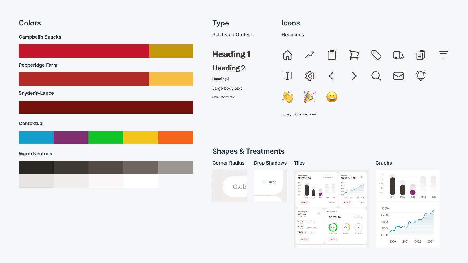
The mood aims to emphasize dynamism, playfulness, and depth. It consists of staggered layouts, dynamic graph elements, generously rounded corners, ultra-smooth iconography, soft shadows, warm neutrals, and a complimentary teal blue as a secondary color with slightly more muted contextual colors.
Art direction mood summary
Applying art direction
Through the process of moodboard exploration, the design team applied the final art direction “mood” to the application home page wireframes. Seeing the UI treatments and visual philosophies in the context of a page layout (the home page of the application) was an important step with the client. Our team had worked with them through months of product discovery, wireframing and prototyping, so leveraging those experiences helped us generate excitement and bring in the next phase of work for our team.
Three branded instances
Campbell’s Snacks is a division under the Campbell’s brand and consists of two child companies - Pepperidge Farms and Snyder’s-Lance. Our color system needed to be able to be branded by the three companies in that snacks division.
Campbell’s Snacks
Pepperidge Farms
Snyder’s-Lance
Platform management tool
We also designed and built a web-based tool for the Campbell’s Snacks back-office team to interface with the independent distributors that Campbell’s Snacks works with as well as manage content on the application and view sales metrics.
The goal was to translate the art direction from the application to the home page wireframes developed during the platform management tool discovery and UX phase. A semantic color system allowed us to remain flexible for future design phases of both the web-based tool as well as the application, regardless of the background colors a designer may want to use.

Design system
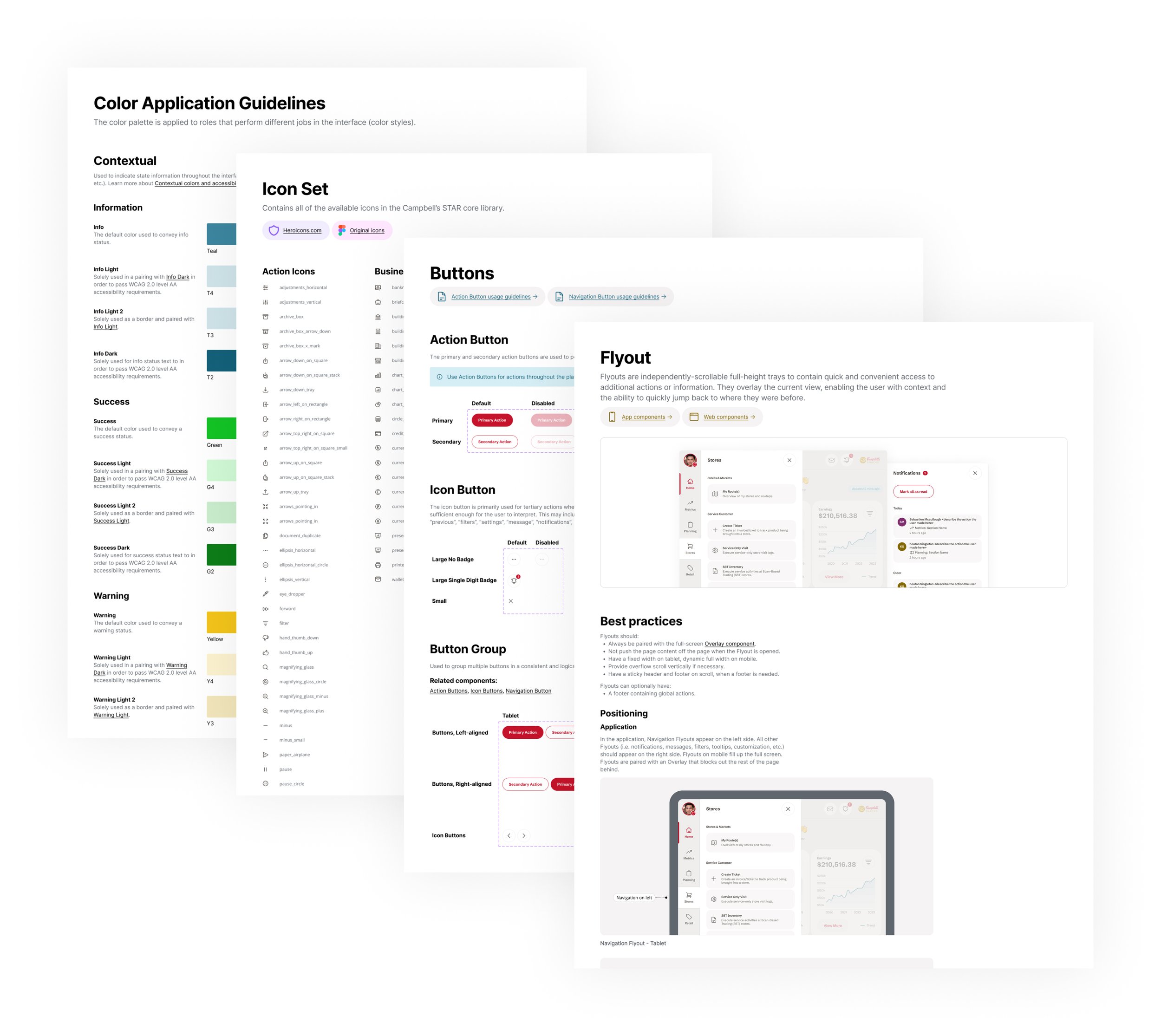
After we were able to validate the art direction on both the application and platform management tool, we built out a design system with the foundational pieces needed to begin the first sprints of feature work. The system is made up of Figma libraries and UI kits, a web-based component library that demonstrates the components and layouts, and thorough documentation for all members of the product team to leverage and cultivate cohesion throughout the interface.

Winning with design
Our team was able to convey a deep understanding of Campbell’s business challenges and product goals through client relationships and delivered materials. The work we did together in product discovery, an interactive prototype, art direction, and a design system led to the Campbell’s Connected Snacks platform becoming the largest contract in Vectorform’s 20+ year history
