
Badgr creates learning ecosystems with skills-based digital badge credentials, learning pathways, and portable learner records.
Design system, UI, WebSett design system
A design system, in a nutshell, is a product that is made up of repeatable solutions for commonly reoccurring problems in software. Bringing together the principles, the why, and the how creates a shared understanding of the application’s styles, usage, and purpose - setting the stage for speedy design iteration and efficient implementation into the product giving the end user a consistent experience. Deliverables for the Sett design system are a component library, UI kit, and documentation. Sett is a work in progress, but that's how it's supposed to be.
Usage guidelines
A set of clear and concise guidelines for every component is critical to the success of a design system. The goal is to offer an efficient path forward for designers and developers from the beginning of the design process through the release of a feature or new component.
Here’s an example of some documentation for the button component:
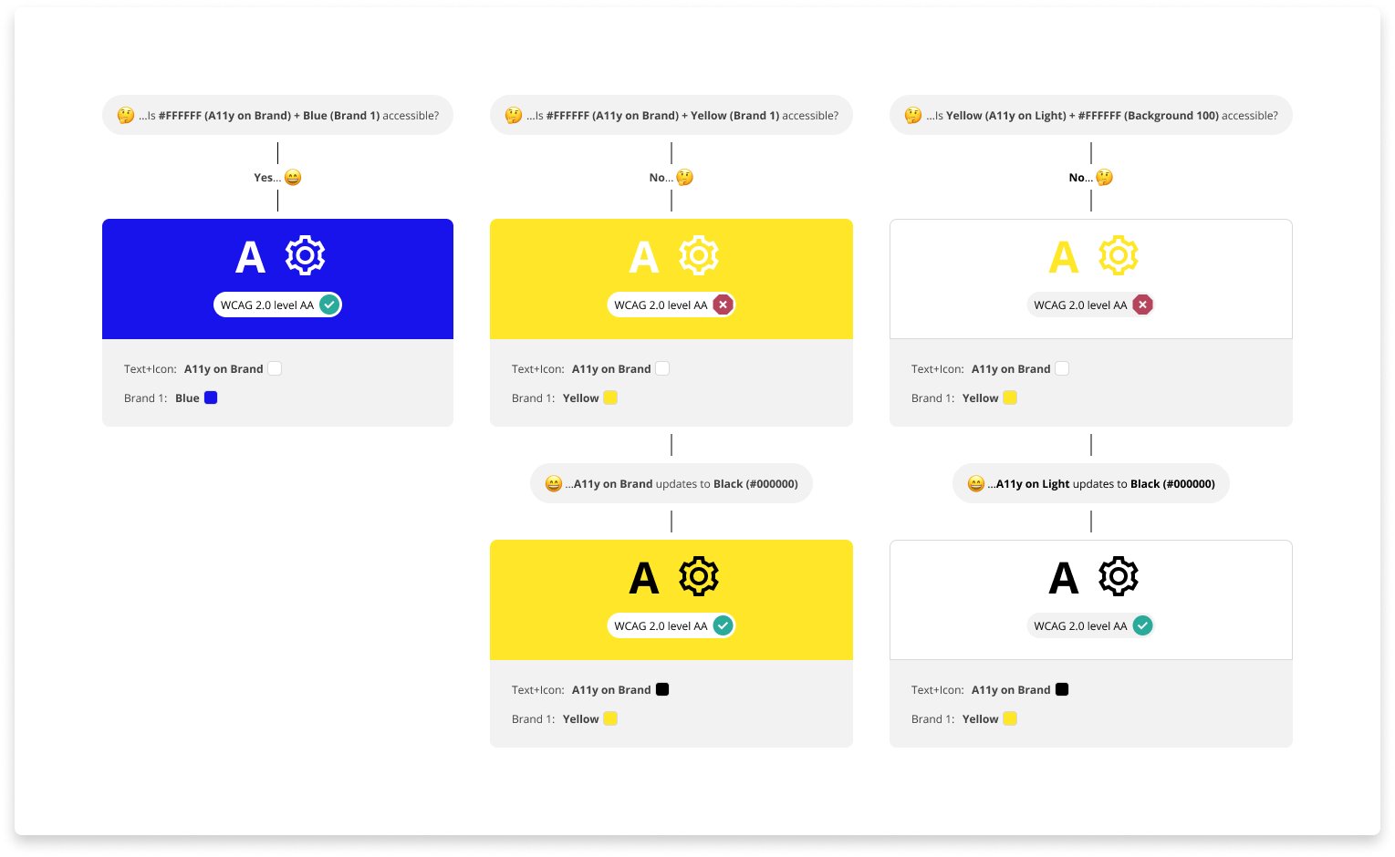
White label
The Badgr application has the ability to be white-labeled, so it is important to use the correct colors for both button background as well as button label.
WCAG 2.0 level AA requires a contrast ratio of at least 4.5:1 for normal text and 3:1 for large text. A contrast checker, like webaim.org ↗️ should be utilized when creating components.