
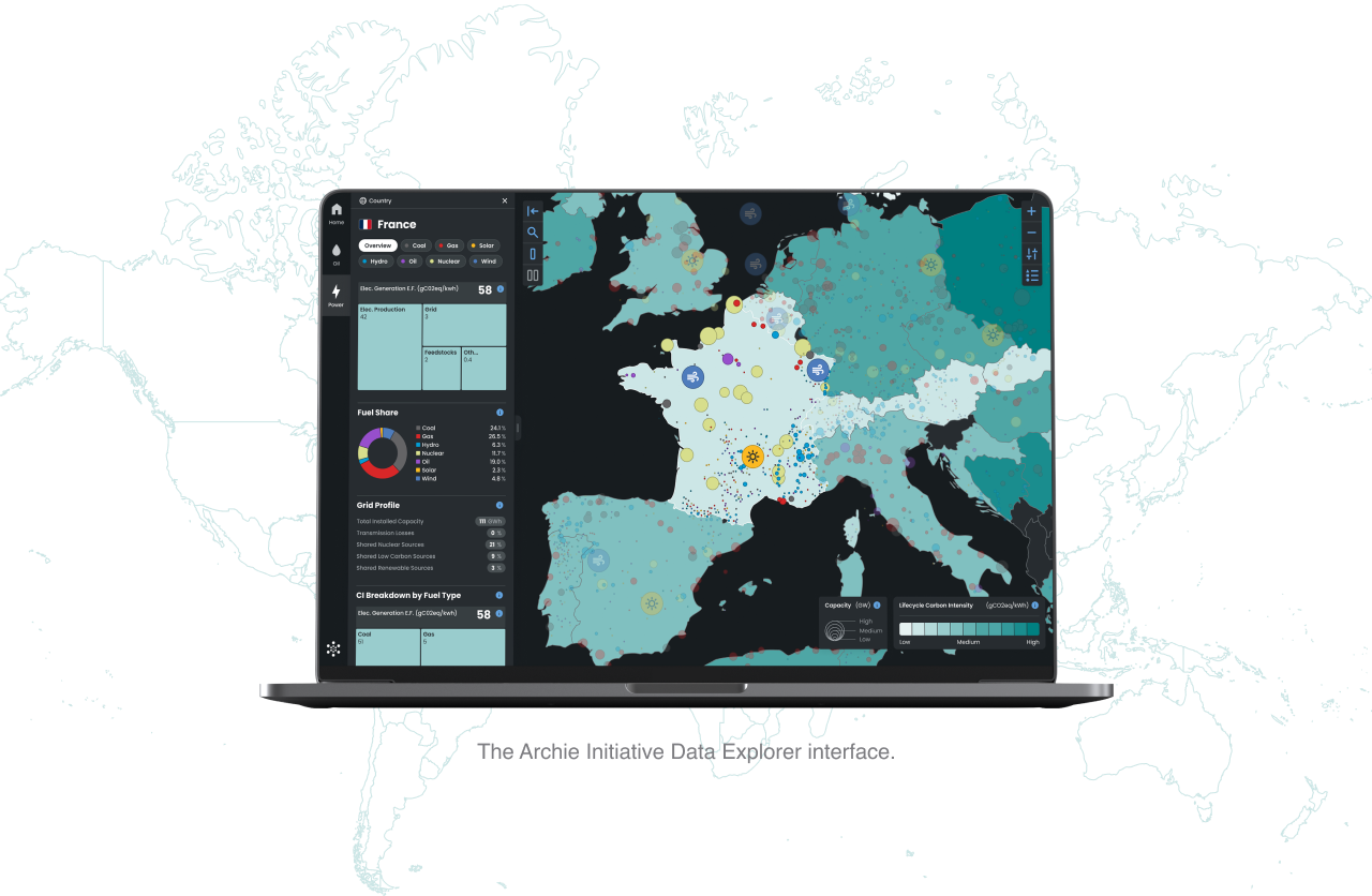
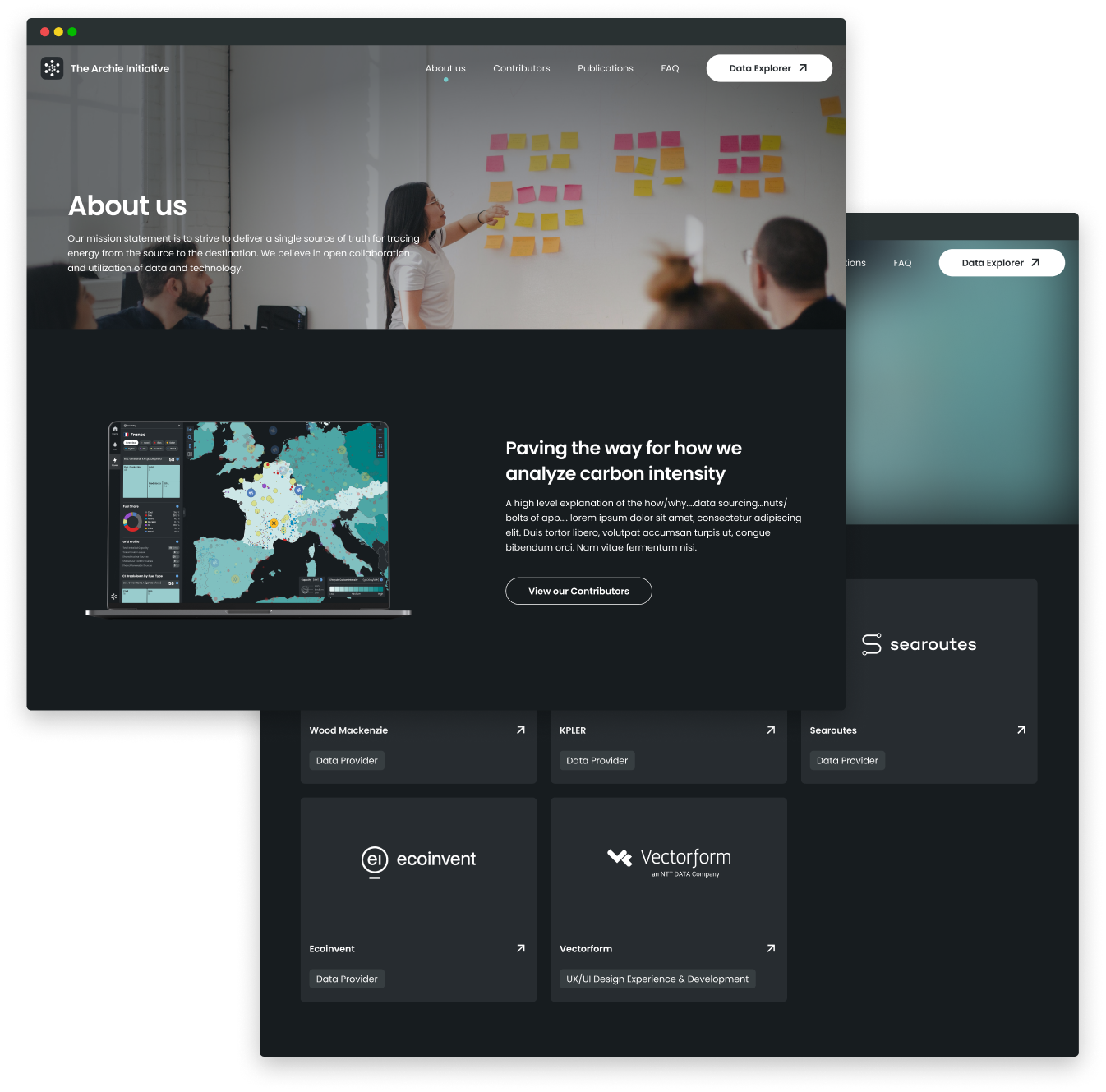
The Archie Initiative visualizes data that represents the scale of carbon intensity, global supply chain, and other insights for oil and power all around the world.
UX, UI, Animation Support, Web
Map and feature showcase
Understand energy markets with better clarity through a full-screen interactive global map and an intuitive interface that offers powerful tools that allow users to explore easily and efficiently.
Data visualization
We did a lot of data visualization exploration as a part of this project as well. The Marimekko chart is a great way to show categorical data, allowing the user to compare two different entities across the same categories.

Looping animations
The design team worked closely with a motion graphics designer to come up with subtle animations that help tell the story of the very immersive and interactive Data Explorer experience.