Motion

Motion and micro-animation bring meaning and a sense of life to digital experiences. They should be purposeful, intuitive, seamless, and surface the personality of the brand/product with details of surprise and delight.
UI, Animation, Motion, Micro-interaction, Prototyping, Interactive ComponentsDirectional patterns of motion
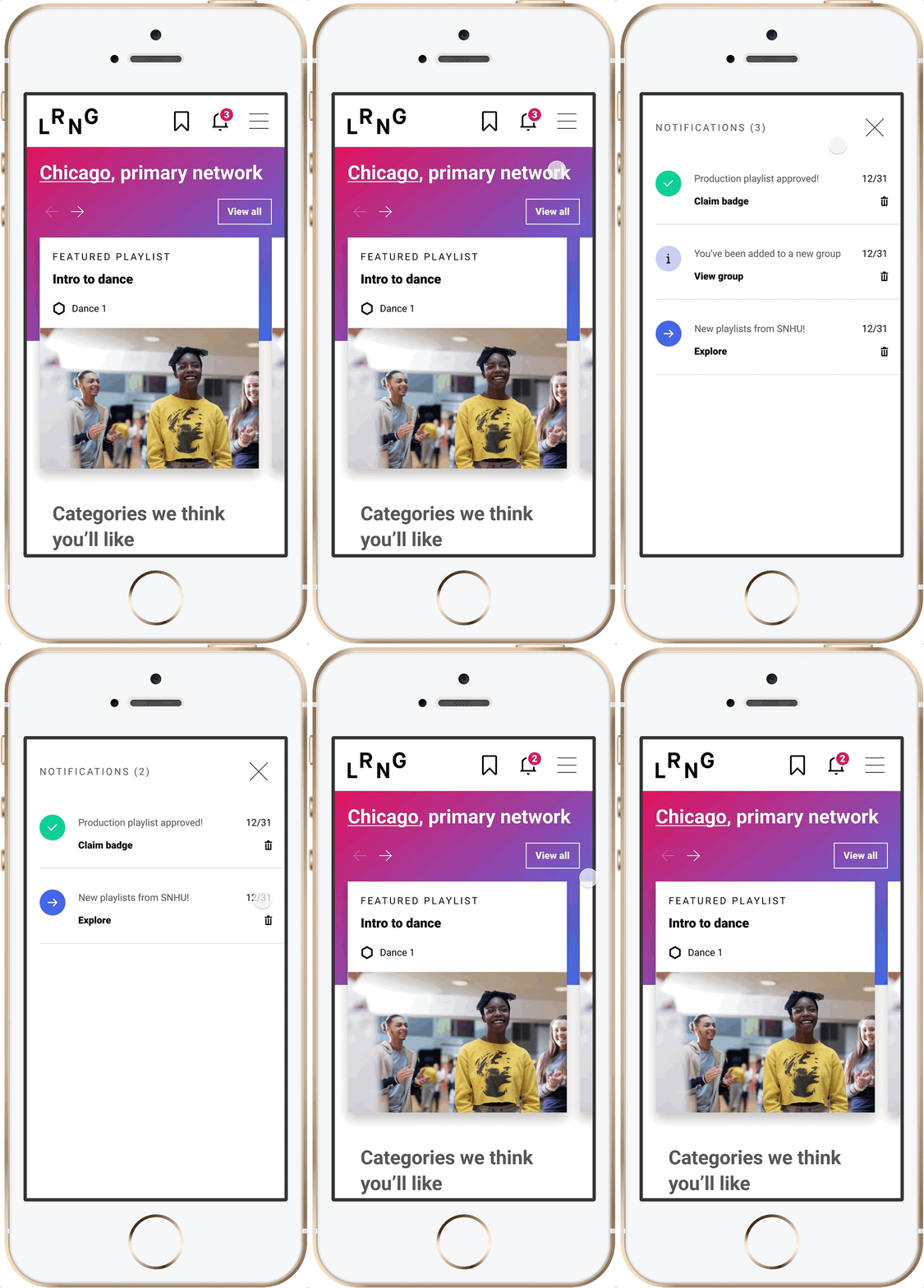
This notifications drawer slides in from the right side of the screen to the left into view. When dismissing a notification, that dismissing motion builds upon directional patterns.

Holistic animation treatments
Any navigational button on LRNG receives the same 1px underline animation - whether it’s a main navigation item, a mobile menu button, or text links. This gives the user a consistent visual language and builds recognition throughout their experience so they can better anticipate the result of the navigational action they take.

Emersion through page transitions
The biggest disconnect LRNG learners were having was how an activity relates to a larger playlist and when, exactly, would they be awarded a badge and exposed to more opportunities. I came up with a page transition animation between the user’s action when they click on a playlist card on the Discover page and navigate to that playlist page. This transitional animation, along with how the activities within that playlist are presented to them is key to tying it all together. One fluid animation removed ambiguity and consolidated the entire experience of making a choice and starting a playlist.

Details of delight
By honing in on the details with micro-animations and moments of delight, I was able to inject some more personality and surprise into what used to be a fairly static interface. These animated interactions were packaged up as interactive components in Figma and then easily iterated upon and implemented as web-components.

Product shot on hover
Len’s Better Shae Butter Soap had beautiful product shots. During the shopping experience customers get a lovely product shot as the card zooms in on hover and removes UI treatments that get in the way of the photography.

Elevating a small brand experience with motion
A card-to-detail page transition animation elevates this small winery business’s e-commerce shopping experience in a simple way and sets them apart from their competitors by elevating the brand experience in subtle ways.

Menu transition
This subtle cascade effect of menu items transitioning in and out elevates this mobile banking app’s experience and brings delight into tasks that are normally just about taking care of business.

